Apply a Common Layout to a Next.js App

This is part 3 in the Build a Blog with Next, MDX, and Tailwind series
If you’ve been following along, you should have a site with very little in the way of content or design. Let’s put some time into addressing the styling before we move on to addressing our lack of content in the next article in the series. Now that we have our app boostrapped and we’ve installed and configured Tailwindcss, let’s create a common layout with some styling to apply to all our pages.
Create the MainLayout Component
We’ll be defining our layout in a React component, so let’s start by adding a components directory to the root of our project and adding a file called MainLayout.tsx to components.
We’ll spend some time refactoring this, but let’s start with this basic shell of a component.
export function MainLayout({ children }) {
  return (
    <>
      <div>
        <header>
          <span>My Awesome Blog</span>
        </header>
        <main>{children}</main>
        <footer>footer goes here...</footer>
      </div>
    </>
  )
}
Don’t worry about the complete lack of styling, we’ll work to improve this shortly.
Apply MainLayout Across the App
With the MainLayout component created, let’s apply it to all of our pages. To do this, we’ll add it to the _app.tsx file under pages.
pages/_app.tsx
import 'tailwindcss/tailwind.css'
+import { MainLayout } from '../components/MainLayout'

function MyApp({ Component, pageProps }) {
- return <Component {...pageProps} />
+ return (
+  <MainLayout>
+    <Component {...pageProps} />
+  </MainLayout>
+ )
}

export default MyApp
That’s it! Now our MainLayout will be applied to all our pages.
Add Meta Data with the Head Component
You may have noticed that with our current setup, we get the localhost address as the title for all your pages. This is because we haven’t provided a title element in the head for any page in our app.
Add Page Titles
Now that we have a shared layout, let’s use that to get some baseline meta data on all our pages at once.
For this, we’ll pull in the Head component from Next and make the following changes to MainLayout
+import Head from 'next/head'

export function MainLayout({ children }) {
  return (
    <>
+     <Head>
+       <title>My Awesome Blog</title>
+     </Head>
      <div>
        <header>
          <span>My Awesome Blog</span>
        </header>
        <main>{children}</main>
        <footer>footer goes here...</footer>
      </div>
    </>
  )
}
That should do it for the title. We can use the Head component on specific pages to provide more specific titles as we build up our app, but we have a solid default in place now.
Define the Favicon
The other thing that might be happening for you, is your favicon may or may not be the one provided in the Next bootstrap. There is a favicon provided in the public directory public/favicon.ico which will put the Vercel logo in the browser tab. On my machine, I see a logo from a different system. The reason for this discrepancy is that I have something from another project cached in the browser for localhost:3000 and we’re not explicitly declaring our favicon for this site. Let’s add a favicon to our meta data.
Add this link tag to the Head element (just under the title tag).
<link rel="icon" href="/favicon.ico" />You might need to force reload the page to get this change applied, but this will use the favicon provided under public. When you want to add your own favicon, all you need to do is replace the file.
Additional Meta Tags
To make it easier to surface our content in search engines, we should add some standard meta tags. Let’s add description, keywords, and author as meta tags.
<meta name="description" content="Awesome Tech Articles!"/>
<meta name="keywords" content="Stuff, Things" />
<meta name="author" content="YOUR NAME HERE" />
I’ll leave it as an exercise to the reader to apply whatever SEO hacks you want to this, I just wanted to provide a baseline.
Style MainLayout with Tailwind
Now let’s start to make this thing look a little nicer, shall we?
Styling the Outer Div
We have a div wrapping our header, main, and footer elements. Let’s style it to create a simple, 3 row layout for our site.
Update the opening div with the following classes and then we’ll go over what they all do.
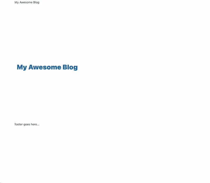
<div className="container min-h-screen mx-auto grid grid-rows-3 grid-cols-1">The container class will set the max-width property of the element based on media queries. Applying min-h-screen will make sure our div stretches to the full view height, even if there isn’t much content, and mx-auto will center our div on the page by essentially filling the difference between the width set by container and the page width with an even amount of margin on either side of the div.
The grid grid-rows-3 grid-cols-1 sequence of classes will set display to grid and apply tailwind’s default rules for grid-template-rows and grid-template-columns using the values 3 and 1, respectively.
This will give us a page that looks something like this:
Fixing The Grid Rows
With the default grid-template-rows rule provided by tailwind, we end up with 3 even rows. The rule provided by tailwind looks like this.
.grid-rows-3 {
  grid-template-rows: repeat(3, minmax(0, 1fr));
}
For our use case, we’re going to want the second row (the content area) to stretch to take up any vertical space not used by the header and footer.
To accomplish this, we’re going to override the rule for grid-rows-3 in our tailwind.config.js file. Update the theme.extend object in the tailwind config to look like this.
theme: {
    extend: {
      gridTemplateRows: {
        3: 'auto 1fr auto',
      },
    },
  },
Here, we’re redefining the rule to grid-rows-3 to make the second row 1fr (one fraction) and applying auto to the other two rows. Now the header and footer will be pushed to the edges and our content area will fill most of the page 🎉.
Styling the Header
Let’s style our header area and add some global navigation while we’re at it.
Style the Headline Text
Let’s start by wrapping the span with our headline in a div. We’ll give this div some vertical padding with py-6.
<header>
  <div className="py-6">
    <span>My Awesome Blog</span>
  </div>
</header>
This gives us some breathing room above the headline without creating any space between our header at the top of the page.
Now we can update the headline styles with something like this.
<span className="text-5xl font-extrabold text-sky-800">My Awesome Blog</span>Now we have nice large, heavy letters and a splash of color.
You might be wondering why we’re not using an h1 here. When using headings on a page, they should be semantically correct and describe the structure of the page. I reserve h1 for the top of the page’s content so deeper headings are properly structured from there.
The top of the blog listing, for example, will get an h1 that calls out that it is the blog listing page.
Update the Heading on the Home Page
With two very similar blocks of text, this is looking a bit weird. Let’s update the index.tsx file real quick.
I’m just going to take it back to a basic message by updating index.tsx to look like this.
export default function Home() {
  return (
    <div>
      <h1>Welcome to my site!</h1>
    </div>
  )
}
Now we have an h1, but it doesn’t have any styling. We can revisit this at a later time. Let’s turn our attention back to the header in components/MainLayout.tsx.
Adding Global Navigation
Let’s work on our global navigation. To start, we’ll add a nav block just below the div that wraps our headline text.
<header>
  <div className="py-6">
	<span className="text-5xl font-extrabold text-sky-800">
	  My Awesome Blog
	</span>
  </div>
+ <nav>

+ </nav>
</header>
Let’s import the Link component from Next and add links for our home page and the blog listing page.
Add the Link import at the top of the file.
import Link from 'next/link'Then we’ll create our two links inside the nav block.
<nav>
  <Link href="/">
    <a>Home</a>
  </Link>
  <Link href="/blog">
    <a>Blog</a>
  </Link>
</nav>
Now we have some links to navigate between our two top-level pages.
Extract a NavLink Component
Since both of these links are going to have the same styling, let’s extract a common component so we can apply all the styling in the same place.
Create NavLink
Create NavLink.tsx in the components folder and we’ll create this component.
import Link from 'next/link'
import type { FunctionComponent } from 'react'

interface NavLinkProps {
  href: string
}

export const NavLink: FunctionComponent<NavLinkProps> = ({
  href,
  children,
}) => {
  return (
    <Link href={href}>
      <a>{children}</a>
    </Link>
  )
}
This is a simple wrapper component, so we could have gotten away without applying types here, but if we choose to extend the behavior and allowed props in the future, this will help us out.
Consume NavLink
Now we need to update our MainLayout component to use these NavLinks.
Let’s update the import at the top of the file
import Head from 'next/head'
-import Link from 'next/link'
+import { NavLink } from './NavLink'
Then we can update the links in nav.
<nav>
-  <Link href="/">
-    <a>Home</a>
-   </Link>
-  <Link href="/blog">
-    <a>Blog</a>
-  </Link>
+  <NavLink href="/">Home</NavLink>
+  <NavLink href="/blog">Blog</NavLink>
</nav>
Style the NavLink Component
With that done, let’s style our NavLink component. Let’s start with some base styling for the a element.
<a className="text-sky-700 px-2 py-1 text-2xl font-bold rounded-sm">We won’t see the effects of rounded-sm just yet, but it will come into play for both hover and active styling.
Let’s go ahead and add some hover styles.
We’ll give the hovered link slightly darker text and a subtle, background with hover:bg-sky-100 hover:text-sky-900. This will leave our link element looking like this.
<a className="text-sky-700 px-2 py-1 text-2xl font-bold rounded-sm hover:bg-sky-100 hover:text-sky-900">
  {children}
</a>
Apply Styling for the Active Link
Let’s also differentiate link styling for our NavLink if it matches the current route.
For this, we’re going to pull in the useRouter hook from Next. Add the following import at the top of the NavLink.tsx file.
import { useRouter } from 'next/router'Now in our component, before our return, we’ll add some logic.
const { pathname } = useRouter()
const isActive = href === pathname
We’ll use the useRouter hook to get the current pathname and compare it to the href prop for our NavLink. If they match, isActive will be true and we can use that to apply some additional styling.
We’ll update our className prop to use string interpolation.
<a
  className={`text-sky-700 px-2 py-1 text-2xl font-bold rounded-sm hover:bg-sky-100 hover:text-sky-900`}
>
  {children}
</a>
I’ve replaces the double quotes around the class names with braces and enclosed the string in back ticks. This should work just like it did before.
Now we’ll add the following expression to the start of our classnames, leaving all the others
${isActive ? 'text-sky-50 bg-sky-800' : 'text-sky-700'}Our ternary is applying a light text color with a dark background for an active link, and applying the original text color when the link is not active.
At this point, the NavLink’s render will look like this.
return (
  <Link href={href}>
    <a
      className={`${
        isActive ? 'text-sky-50 bg-sky-800' : 'text-sky-700'
      } px-2 py-1 text-2xl font-bold rounded hover:bg-sky-100 hover:text-sky-900`}
    >
      {children}
    </a>
  </Link>
)
I’m going to take this one step further. I don’t love the hover styles taking over the active styles so I’m going to group the hover styles with the default text color in the false branch of the ternary expression. With that update, this is final (for now?) NavLink code.
import Link from 'next/link'
import { useRouter } from 'next/router'
import type { FunctionComponent } from 'react'

interface NavLinkProps {
  href: string
}

export const NavLink: FunctionComponent<NavLinkProps> = ({
  href,
  children,
}) => {
  const { pathname } = useRouter()
  const isActive = href === pathname

  return (
    <Link href={href}>
      <a
        className={`${
          isActive
            ? 'text-sky-50 bg-sky-800'
            : 'text-sky-700 hover:bg-sky-100 hover:text-sky-900'
        } px-2 py-1 text-2xl font-bold rounded`}
      >
        {children}
      </a>
    </Link>
  )
}
Styling the Footer
While we’re focused on making our site look half-decent, let’s round it out with some footer content and styling.
Back in the MainLayout component, we’ll update our footer with the obligatory copyright notice and some social media links.
Layout the Footer with Flexbox
Let’s update the footer with the following code.
<footer className="py-10 flex justify-between">
  <div>COPYRIGHT</div>
  <div>SOCIAL LINKS</div>
</footer>
We’ve updates the footer with a healthy dose of vertical padding. We’re also setting the display to flex with the flex class, and using justify-between to push the two child divs to their respective sides of the container.
Let’s create a small degree of separation from the main content by adding a top border as well.
-<footer className="py-10 flex justify-between">
+<footer className="py-10 flex justify-between border-t-2 border-sky-700">
  <div>COPYRIGHT</div>
  <div>SOCIAL LINKS</div>
</footer>
Social Links
For our social links, we’re going to use standard a tags, since these will be going out to another site and won’t ever participate in Next’s routing.
replace SOCIAL LINKS inside the second div with the following code.
<a
  className="text-sky-700 px-4 font-semibold"
  href="https://twitter.com/YOUR_USERNAME"
>
  Twitter
</a>
<a
  className="text-sky-700 px-4 font-semibold"
  href="https://github.com/YOUR_USERNAME"
>
  GitHub
</a>
You’ll notice each of these links is styled in the same way. I’ll leave this as an exercise to the reader to extract these links to an external React component if you’d prefer to manage the styling in a single place.
Copyright
The last item remaining is our copyright notice. Let’s update the first div in our footer to look like the following code.
<div>© 2022 YOUR NAME HERE. All rights reserved.</div>Let’s throw a couple classed on their to give it a similar style to the surrounding elements.
<div className="text-sky-700 font-medium">
© 2022 YOUR NAME HERE. All rights reserved.
</div>Finally, let’s replace that hard-coded year with an expression to display the year based on the current date.
<div className="text-sky-700 font-medium">
© {new Date().getFullYear()} YOUR NAME HERE. All rights reserved.
</div>The Final Footer
Now that we’re done with that last piece, the full footer element in MainLayout.tsx should look like this.
<footer className="py-10 flex justify-between border-t-2 border-sky-700">
<div className="text-sky-700 font-medium">
© {new Date().getFullYear()} YOUR NAME HERE. All rights reserved.
</div>
<div>
<a
className="text-sky-700 px-4 font-semibold"
href="https://twitter.com/YOUR_USERNAME"
>
Twitter
</a>
<a
className="text-sky-700 px-4 font-semibold"
href="https://github.com/YOUR_USERNAME"
>
GitHub
</a>
</div>
</footer>I’m not a designer (I know, hard to tell, right? 😅) and there is a lot to be desired in the styling choices here. My primary goal here was to go through some high-level concepts and provide a little insight into the process that goes into sharing a layout in Next and how we can style our UIs with Tailwind without a ton of duplication by refactoring elements to components.
In the next article in this series, we’ll move on to pulling in our MDX content to start populating these placeholder blog posts.
Check back next week for the next article in the series, Render Posts with MDX!